PPC landing pages are the first things your leads see after they click on your PPC ad. If they’re poorly created (or just links to your homepage), those leads are likely to bounce, costing you two missed opportunities:
- You’ve lost the chance to convert a potential customer.
- You’ve squandered PPC ad money that could’ve been used to bring in more leads.
The best landing pages are optimized machines that take in leads and pump out conversions. They convert leads because they’re professional, designed with a single goal in mind, and leverage technology to boost conversions.
If you aren’t investing time into making the best possible PPC landing pages, you are wasting a good chunk of your PPC advertising budget on bounces. By creating optimized landing pages for each ad or product, you get a higher ROI on your ad spend because your landing pages can better address user pain points, convince users of the benefits of your product, and improve your conversion rates.
Be Professional to Reduce Your Bounce Rate
The average user takes only 50 milliseconds to judge the quality of your website. These tips help you make the most out of that time by creating a professional first impression. A strong first impression gives users confidence that they’re dealing with an honest company with a product they’d be interested in learning more about.
Use High-Quality Hero Images
Research has shown that humans can process visuals 60,000x faster than text. A high-quality hero image—the image at the top of a page—takes advantage of this and can create that strong first impression you need to convince people to stay on your landing page and learn more.
Effective visuals for your landing page need to:
- Be positioned near the top of the page where users can see them.
- Be high quality.
- Be relevant to your product, ideally showing how it is used.
As well, most hero images include text overlay. This text needs to be easy to read and include the most important message you want readers to remember when they leave your page.
Toothpaste maker Kaylaan makes sure that the first thing you see on their landing page is their hero image. It works because the image shows the toothpaste in action, and the text overlay is easy to read. It drives home their unique value props: the toothpaste is made in New York, and it’s eco-friendly.

If you’re a searcher that clicked on an ad for locally made or eco-friendly toothpaste, this hero image will give you confidence that you’ve found the right place.
Tour company Gray Line also uses a hero image to sell their Christmas tours but to a much weaker effect. The image they use is grainy and blown out, the text is difficult to read because parts of it are white-on-white, and it doesn’t tell us why you should choose their services.

With so much of your first impression relying on this one image, it’s essential to get it right. It doesn’t need to be fancy, but if you can keep it high quality, easy to read, and on message, you’ll be on the right track.
Be Mobile-Friendly
If your landing page isn’t optimized for mobile users, you’re missing out on over half of all internet traffic. Mobile users expect mobile-friendly landing pages, and missing out on this can make you look unprofessional and lead to bounce rates north of 50%. On top of this, Google considers mobile-friendliness when ranking Google Ads, so making your landing page mobile-friendly can help you get your ads to the top of the SERP.
Improving mobile-friendliness can be as easy as increasing the sizes of clickable buttons and landing page copy. On small screens, small buttons that are close together can be difficult to navigate, and small text can be a pain to read. Another area that needs to adapt on a mobile site is the menu. Menus should be simplified with larger icons to make it easy to click on them and navigate.
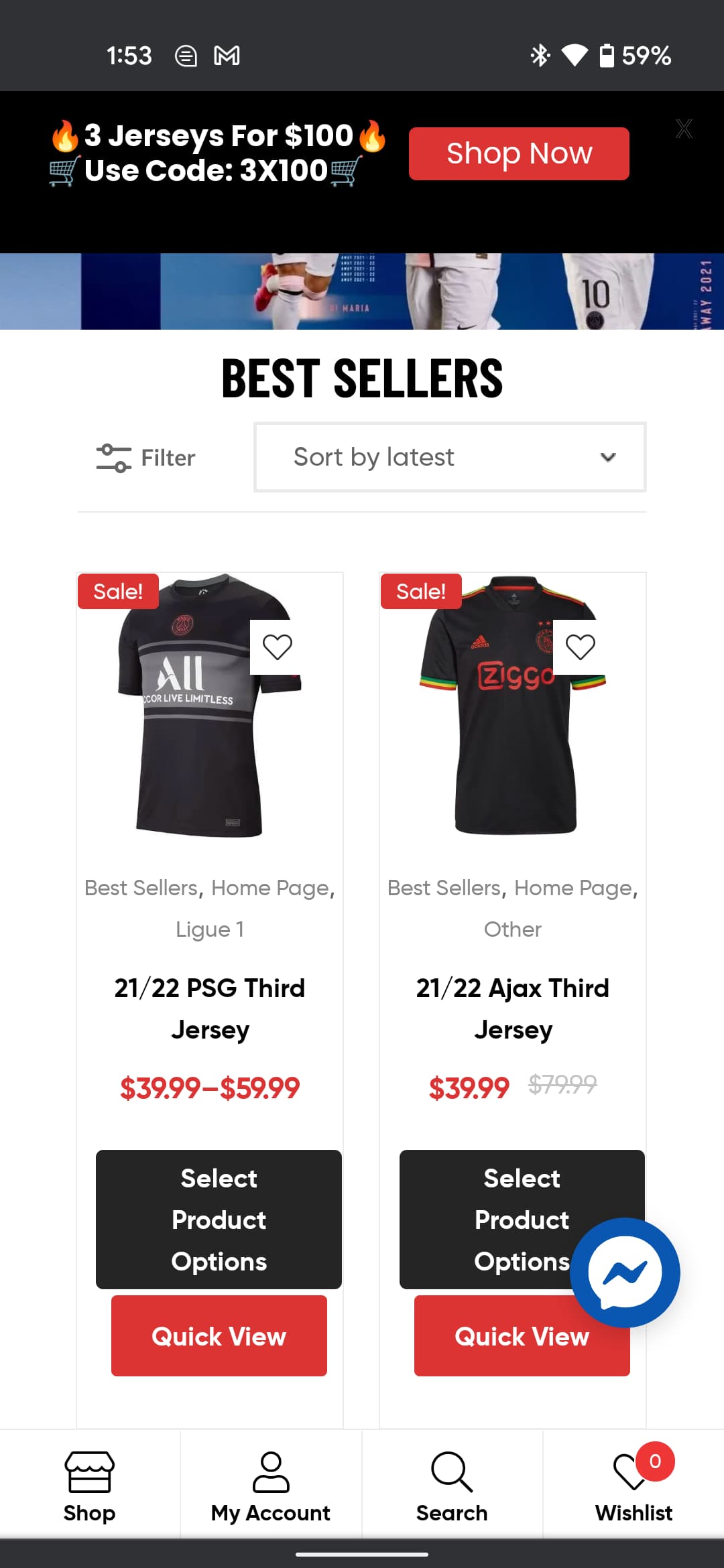
In these two ecommerce examples, we see landing pages for soccer jerseys from jerseyloco.com and lids.ca. Jerseyloco (top) uses a mobile-friendly landing page design, while Lids (bottom) seems to have just copied their desktop site.


Navigating the mobile website for Lids is a hassle because the buttons are too small with text that is hard to read. Jerseyloco has made its buttons more prominent, added customer service on Messenger, and placed an easy-to-use menu on the bottom of the screen that offers a better user experience than the traditional menu from Lids.
Deliver What You Promise in Your PPC Ad
Landing pages need to be extensions of their PPC ad counterparts to be successful. Your PPC ad entices readers to click, and then your landing page convinces them to convert.
If readers sense that you’ve pulled a bait-and-switch—convinced them to click with one thing and given them another—they’re going to see your ad and landing page as a scam and bounce.
Obviously, this includes blatantly lying to readers. If you say something is $100 and it turns out to be $200, that will cause people to bounce. However, this can also relate to the less tangible promise of what they expect to see.
This PPC ad from wondrium.com seems to promise a Cooking 101 class from Chef Kahlenberg.

When you click through, though, you get this list of cooking classes. Chef Kahlenberg’s class might be on this list, but readers will feel, at best, annoyed that they have to find it, or at worst, lied to.

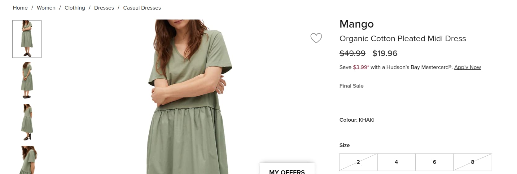
Any promises you make in your search ad, display ad, or shopping ad, explicit or implicit, need to be included on your landing page. This ad for a dress from the Bay uses exactly the same photo between its PPC ad and landing page to create that continuity.


By using the same image, the Bay makes the process seamless, from seeing the dress on the SERP to clicking on the ad to adding it to your cart before checkout. If people click and see something remotely different, then it might put doubt into their minds, reducing the chances of you making that sale.
Design With a Single Goal in Mind to Make it Easy on Readers
Once you hook your reader and convince them to give your page actual consideration, your next step is convincing them to convert. A single-minded design philosophy is the best way to achieve conversions. When your design, call to action (CTA), and content are aligned, you can create powerful arguments that give readers the push they need to take the next step toward conversion.
If you want to sign people up for your program, your landing page’s single goal needs to be to convince people to sign up. Your media should show off your program, your ad copy should be targeted at these readers’ specific pain points, and your design should funnel them to a clear CTA that gets them to take the next step. Anything else on the page becomes clutter that distracts from this page’s singular purpose.
Have a Clear CTA
A CTA is an action you want readers to take after seeing your landing page, like “Shop now” or “Register today.” A good CTA is direct and clear: readers should know exactly what action to take and what clicking on your CTA button will lead to. When you create a clear CTA, you tell readers what to do next, and you give your landing page a focus to build around.
If you know your CTA is “Start Your Free Trial,” then you could add text elements explaining the benefits of the free trial, customer testimonials saying how much it has helped them, and an image of what your service offers. All of these elements are designed to overcome a natural hesitancy to sign up for a free trial by showing readers how much they have to gain by giving your product a try.
The shoe company Vessi has two clear CTAs on its landing page: “Shop Women’s Sale” and “Shop Men’s Sale.” The buttons are prominent on the page and clear about what they want users to do next. Anyone who lands on this page will immediately know that clicking on the buttons will take them to browse women’s or men’s shoes.

This landing page from a local electrician shows what you shouldn’t do with your CTAs. On this mobile landing page, there are three potential CTAs: “Get Help Now,” “I Need Help Now!” and “Book an Appointment.”

These CTAs have three main problems:
- They’re too small and aren’t easy to pick out on the page.
- It isn’t apparent what the difference is between “Get Help Now” and “I Need Help Now!”
- It’s unclear what happens if you click “Get Help Now” or “I Need Help Now!”
This landing page would be more effective if they removed “Get Help Now,” made the buttons bigger, and changed the text on the “I Need Help Now!” button to something clearer like “Call Us Now.”
Declutter Your Landing Page for Quicker Browsing
The average reader remains on a website for a very brief amount of time. Some say 10 seconds, others say 15, but regardless of the specific length of time, you need to get your point across fast. Websites that keep their landing pages simple have much better conversion rates. According to Google, when a page’s number of elements increases from 400 to 6,000, the chance of conversion drops by 95%.
A decluttered landing page is one where all of the key elements on the page serve a purpose. The CTA is clear and obvious on the page with the necessary text, images, and trust signals around it to convince readers to click. Another element of a decluttered landing page is design. One main font and color scheme gives the page a unified feel, while lots of empty space between elements draws readers’ eyes to the most important parts of your landing page.
Ring.com’s landing page is an example of a decluttered page that focuses on only the most relevant parts of its pitch and uses design to highlight them. At the top of the page is a clear hero image of its alarm system with some text that describes its main value prop and a CTA button that uses contrasting colors to pop from the screen.

Beneath this main hero image is more content that goes over the advantages and details of this product, which can help the reader if they need more information before they commit. Ring shows the power of less is more. By leaving some of its page’s real estate blank, it draws readers’ eyes to what they want readers to focus on, leading to better conversions.

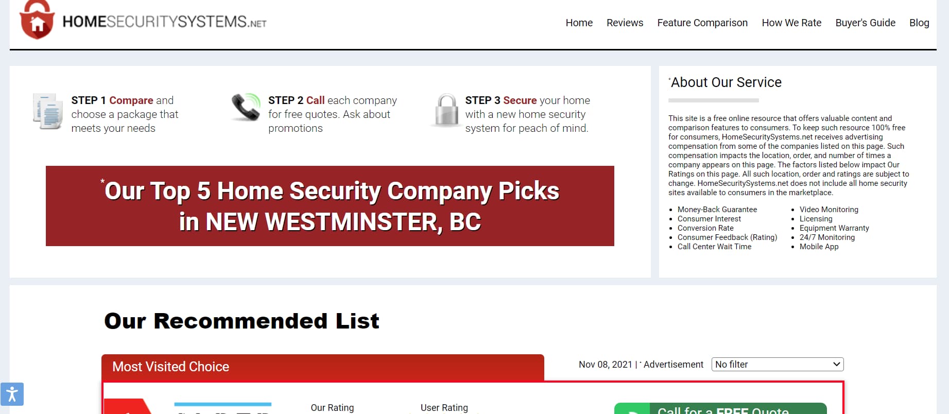
Home Security Systems’ PPC landing page is too cluttered to be effective. The page has no focus, with “About Our Service,” “Our Recommended List,” and “Our Top 5 Home Security Picks,” all vying for your attention.

It’s unclear what they want readers to focus on, and there is no obvious CTA showing them how to take the next step. Most readers won’t take the time to scan the whole page and will instead choose to find another site.
Part of the problem is that it has too much content. The “About Our Service” section should be moved to give the header section more room for a proper image or CTA.
Add Trust Signals and Content Targeted at Your Audience
Trust signals and content help you convince readers of the merit of your offer. They convince readers that what you offer will benefit them and that your company can be trusted to deliver on its promises. Common trust signals are kinds of social proof like customer testimonials or industry accreditations, while content is usually images of the product or written descriptions of the benefits it brings.
The trust signals and content you choose to employ on your landing page are determined by your audience: what will they find convincing? Consider what would put your audience at ease. If you’re selling expensive medical products, then testimonials from doctors would help. On the other hand, if you’re offering a free-to-use spell-checker, good spelling and nice images might be all you need.
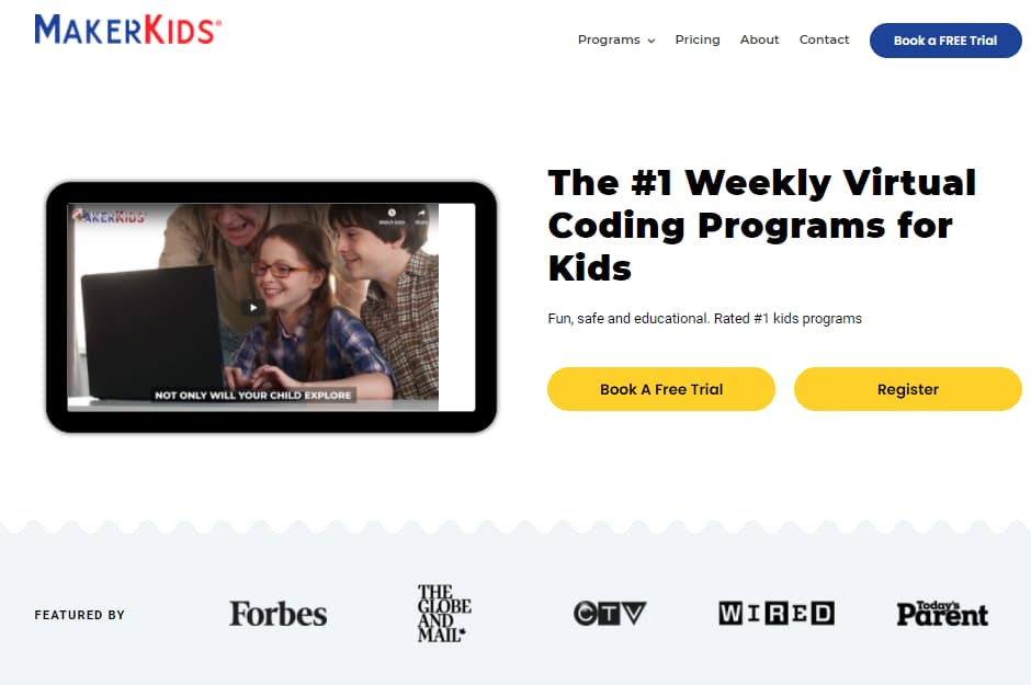
On its Coding Programs for Kids landing page, MakerKids includes some text and an image (which links to a YouTube video) to show parents what they’re paying for. The landing page also has logos of recognizable brands that have featured its course to show that its product is well known and trustworthy.

In contrast, BYJU’s Future School leaves out all content and trust signals, making its landing page untrustworthy because there is no information about what class you’re signing up for. This landing page fails because it feels like it’s only asking for your information without offering anything in return.

To improve its landing page, BYJU should add an image of its program plus some basic text describing what a free class would look like, what your child would learn, and what the credentials of the teachers are.
Use Technology to Achieve Success
Technology boosts your conversions by finding ways to optimize your landing page experience for your readers. The two most important ways you can use technology to improve your landing page are by speeding it up and testing it for better conversion rates.
Improve Loading Times
Google has stated that when load speeds go from one second to 10 seconds, they see the bounce rate increase 123%. So if you want readers to stick around, you need to bring down your load times as much as possible.
Google has made this easy by creating PageSpeed Insights, a free tool that measures your page speed and offers tips to bring it down. After inputting your URL and running the test, simply scroll down to the “Opportunities” section and start implementing.

Some fixes are more technical and work-intensive than others. For instance, reducing unused JavaScript might be better done by your developers that can go through your code and remove anything that isn’t required to run your site.
However, there’s an easy thing you can do to make a huge dent in your load time: optimize your images. You can optimize your images by following three quick steps:
- Pick the right image format for the job.
- Compress your images with a free tool like Squoosh.
- Resize your images before you upload them, or they’ll need to be resized each time the page loads.
These steps take minutes to implement and can make a huge difference on pages with lots of images.
Track Analytics and Optimize
Analytics on how your page is actually performing can be used to tweak your landing pages to make them more effective at converting readers. The easiest way to find optimizations that’ll boost conversions is with A/B testing, where two versions of a landing page go head-to-head to see which works best.
A/B tests performed on your top landing pages help you decide which layouts, images, or CTAs lead to better results for your bottom line. As well, once you see what works with one landing page, you can try to replicate those results on other landing pages for a cascade of conversion boosts.
When running an A/B test, there are some basic best practices you should always follow. First, a good A/B test starts with a clear hypothesis that you plan on testing, such as fewer images will lead to better conversions. Second, your test should only change one thing; that way, you know whether that one change had an impact on its own. Finally, give your test enough time to run with enough visitors to get a representative sample size. You can get an estimate of how many visitors you need for your landing page with this sample size calculator.
There are several A/B testing tools on the market these days, but if you’re already advertising on Google, you can set up your test directly on its platform. Simply sign in to your Google Ads account, head to the left-hand bar, and then click Show more/Drafts & Experiments/Campaign experiments.
From this screen, follow the prompts to turn one of your draft campaigns into an A/B test experiment with one of your existing ad campaigns. You can learn more about Google Experiments on their about and instructions pages.
Use the Best PPC Keywords to Bring in Relevant Paid Traffic
An optimized landing page works best when you bring in the people it’s designed to convert. When you know who will land on your page, it becomes infinitely easier for strong PPC keywords to bring you that relevant traffic from search engines. If you want to learn more about setting up strong PPC campaigns that drive traffic and conversions, take a look at our PPC audit and guide to PPC management.

